I personally very much enjoy making my own scripts, so I will give some advice I posted elsewhere, and also add some things. Some of this may not apply to all the things that everyone has said, but I think that it is good advice in general, so I will just include everything.
In order to design your own script, you should understand how extant scripts work. I'm going to limit my explanation for the first part
mainly to modern scripts since they are the ones that are typeset and uniform, so it is easier to study them.
Part 1
So, first of all, choose any modern script. When you look at the letterforms, you will notice that:
1. Certain shapes, lines, and curves occur frequently.
Examples:
- Latin (lower-case) script has a great number of vertical lines. It also has a lot of rounded curves, especially on tops and bottoms of letters.
- almost all Oriya letters have rounded tops. There are also a lot of circles, "n" shapes, and angled or very short straight lines
- Georgian has a large amount of "O" and "U" shapes
2. Certain shapes, lines, and curves don't occur in any or almost any characters.
Examples:
- No Latin letters have very open curves, like (. There are also very few horizontal lines: in the lower-case letters, only f and t, in upper case only AEFGHLTZ
- Chinese characters entirely lack tight curves and circles
- Buginese entirely lacks horizontal or vertical lines of any kind
- Futhark has no curves of any kind
3. The weight of the strokes (thickness and thinness) varies from script to script, usually because of the writing implement.
Examples:
- Arabic and Devanagari have angled reed-pen style writing that creates predictable thick, thin, and medium strokes
- Ge'ez and Armenian have all vertical strokes thick, and all horizontal strokes thin (more or less)
- Latin (serif) and Tamil have variable thickness based on stylistic considerations
- Oriya, Gurmukhi and Canadian Aboriginal Syllabics have an entirely uniform thickness, regardless of stroke angle or anything else
4. Some scripts have serifs, and some don't.
Examples:
- Latin has rounded triangular serifs
- Chinese brush script has serifs on all the ends and corners (except bottoms of strokes)
- Arabic has hooked serifs on tall vertical strokes
- Sinhala has little ball-shaped flares on little curved strokes on the top (but not on big curved strokes)
- Cuneiform has characteristic flares
- Hebrew has small upstrokes on the ends of strokes along the top
- Batak, Devanagari, Futhark, Thai, etc. have no serifs.
Adding interesting and
consistent serifs can add distinctiveness to a script. I was once designing a script that belonged to a script family, but no matter what I did the script just really sucked hard. It was boring and uninspiring. Then I designed a set of comprehensive and consistent serifs, and the script was saved from being scrapped. By no means is it my favourite among the scripts I've designed, but it's grown on me.
 Part 2
As others have touched on, it is important to consider what the people write with.
- As mentioned earlier, scripts such as Arabic and Devanagari use an angled reed pen, which produces a characteristic, and mostly invariable, angled thick-thin stroke to the letters.
- The variable thickness of Latin copperplate cursive, on the other hand, arises from the use of a pointed nib (contrasting with the flat-nibbed reed pen). The pressure applied when writing determines the thickness of the stroke.
- The roundness of Oriya, Telugu and Kannada scripts is a direct result of scribes being careful not to damage the palm leaves they were writing on, and is a clear contrast to the rather angular Brahmi script, from which they are descended. Brahmi's angularity, on the other hand, likely arises from being incised into rock.
- Futhark is another obvious example: as it was mostly incised into wood or stone or what have you, it ends up being very angular, like Brahmi. It also lacks horizontal lines, probably to avoid having strokes run along the wood grain.
- The flaring thin/thick contrasts of Chinese lines, as well as the hooks that appear in the script are characteristic of brush writing. The Chinese Ming typeface is a result of a slight adjustment of standard character proportions and shapes to fit on movable type. It has serifs (visible on the right side of the line in '一') that are a stylistic imitation of the enlargement that occurs when the brush pauses at the end of the stroke, and overall the typeface is likely influenced by the Latin script.
One problem I see with a lot of conscripts is that people will just take a pencil, ballpoint pen or marker and just write shapes with it. Only after they have done this will they begin to consider, often as an afterthought, if at all, what implement the script is meant to be written with. This is fine if you're designing an incised or etched script, and for a number of other scripts you can get away with it without much problem. However, the writing implement can heavily influence how the writing looks.
Take a look at these scripts here; can you imagine ever coming up with these letterforms if you were starting out writing with a ballpoint pen?
Sogdian:

Akkadian:

Siddham:

Semi-cursive Japanese:

Khotanese:
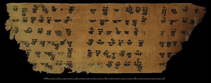
Obviously many scripts can be designed with a pen or pencil, but it's something to keep in mind.
Part 3
For people like Micamo who have trouble designing an alphabet or syllabary but want to design an entire logographic script, this is probably a really bad idea. You probably think I am saying it's a bad idea because it takes a lot of work, and you're right, but there is another reason it's a bad idea. Every time I've seen someone design a conscript and show the characters from a logographic script that it supposedly descend from, the characters shown are invariably basic pictographs or ideographs. This simply isn't how it works. If a society has an entire functional logographic script from which to choose source characters for a syllabary, why would they seek out only basic pictographs or ideographs for this? The script is bound to have any number of compound characters and characters with meanings that are obscure or difficult to express in writing that get chosen anyway. For examples, just look at Hiragana (where say, り
ri comes from 利 "profit; advantage", ぬ
nu comes from 奴 "slave; servant", る
ru comes from 留 "stop; halt; detain; retain", き
ki comes from 幾 "how much/many") or Hittite cuneiform, where
e comes from "barley" or "strip of leather" or "levee" (or who knows what...god, cuneiform makes no sense at all).
Part 4
Here is my suggestion if you're really having trouble:
1. Draw some basic glyphs in the style you want, even if they're not perfect.
2. Choose some restrictions, like "vertical lines are forbidden" or "no tight circles allowed" or "most glyphs have a V shape on the bottom (with a few exceptions allowed)" or "there can never be more than two horizontal lines stacked parallel in a single character (meaning, a letter shaped like <E> would be impossible in this script, and a letter shaped like <F> would almost certainly not exist, instead more likely being a squared-out C) These restrictions tend to be stylistic or practical, like maybe too many horizontal strokes is impossible because the pen makes really thick horizontal lines, or maybe horizontal lines are forbidden because like in Futhark they run with the wood grain.
3. If you're feeling ambitious, choose a writing implement
4. Rewrite all the glyphs, incorporating the restrictions you created (and using the writing implement you chose)
This will help to give your script a somewhat uniform look.
Part 5
If you're having trouble writing letters clearly and distinctly, I suggest getting some grid paper. This is how they teach children to write in Japan:
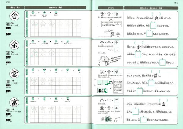
You can get some even tighter grid paper so that there are, say, 16 squares per glyph rather than four. Try writing out the glyphs
I hope this post helps someone!
