The sounds not in nĆaulaosz (aspirates and labiovelars) are obviously dropped, except the grapheme for /pʰ/ now stands for /f/.
Being a Thousand years later, a "cursive" script has developed, but "official" announcements and documents must be written in "Old Script".
I will state some basics of the script's composition, so some of the diacritics maybe understood: The following strokes are availible: Horizontal Line, Vertical Line, Ascending 90 degree diagonal, Descending 90 degree diagonal. All letters must contain one of the first two; the diagonals are only decoration. Also, each letter can only contain one each of the first two, The Vertical being the "primary" line if it contains both; ones featuring only a horizontal line will consider that the "Primary". All letters contain either a Vertical and Horizontal or a base and at least one diagonal, whose horizontal reach will be that of the horizontals in vertical-only letters, and whose height will be the same as the verticals in horizontal-only letters.
The graphemes for /ʃ ʒ/ are formed by putting a small version of the /j/ grapheme under the graphemes for /s z/.The same tactic is used for the i-onglide diphthongs. The Retroflexes are formed by a line parallel to the "primary" of the /t͡ʃ d͡ʒ s z/ graphemes. The same tactic is used for /ɫ/ from /l/, and /ɯ aɯ e o/ from /u au e o/(The e and o graphemes now represent /ɛ ɔ/. Lenited consonants are formed by putting a small /h/ grapheme under the consonant, including lenited forms that occur without lenition (/r x/). The /n/ grapheme is used the same way for eclipsed consonants.
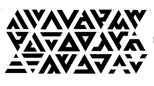
An Example:

It says <Ćaulaoszith nDaonie> /t͡ʃaulɯʂiθ nɯnie/ "Of the Ćaulaosz People"


 Śād Warḫallun (Vrkhazhian) [